Case Study - Power Business Services
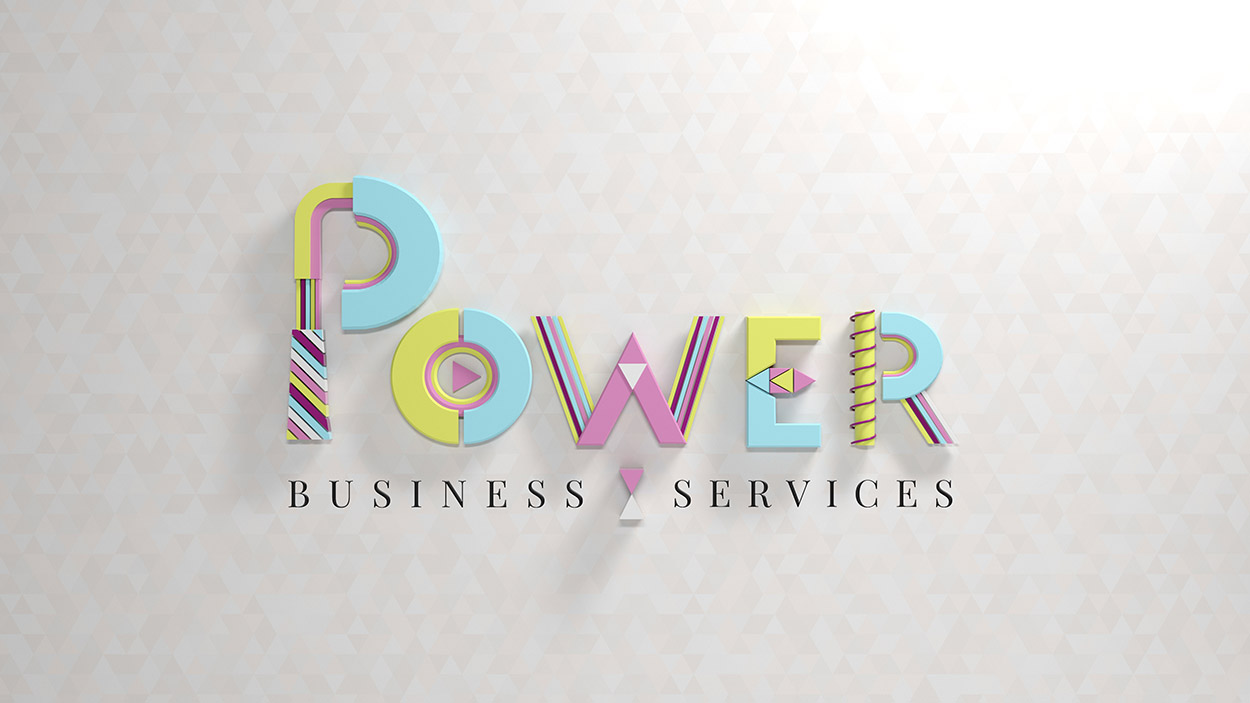
Power
Playful in nature, powerful in business
When you hear business services you may instinctively think stuffy and scary, the exact opposite of what Karen wanted her brand to evoke. So we unleashed all of our creativity to develop a fun and mischievous brand identity that instills confidence in potential clients.
A Power(ful) Brand Identity
We love being tasked with creating something that doesn’t conform and stands out from the crowd which is the brief we got from Karen.
When it came to discussing the brand concept, we met up with Karen and Rachael from Feed Marketing for a creative brainstorm.
Rachael, who specialises in helping businesses tell their brand story, was an integral part of the process, helping to draw out some of Karen’s likes and dislikes when it comes to colours and design.
Colour is key, and right from the start Karen wanted to steer clear of the standard corporate colours preferring a pastel palette.
Next came the design, we took the playful theme and ran with it. We took inspiration from art deco style fonts and toy blocks to create a vibrant logo that’ll stand out from competitors.
For Power we made the decision to render the logo in the 3D which really makes it pop, and will also allow us to create a captivating animation further down the track.
We also designed Karen’s business cards, with the Power logo taking precedence on the front and the contact details on the back. Allowing the brand identity to stay front and centre.
Powerful, proactive and playful.
We love helping businesses create a spectacular brand identity, watching them grow and being a part of their continued journey to success.
I found Karl really easy to work with, he listened, understood and created a beautiful and strong logo that I am proud to use